By Dr. Lamiaa Adel Shaheen
Architecture is not only about physical form and functional efficiency but also about shaping the psychological, emotional, and cognitive experiences of users, and within this holistic process, color selection emerges as one of the most powerful yet often underestimated tools that designers can employ to influence human behavior, perception, and creativity. Colors can alter spatial perception—making a room feel more expansive or intimate while also creating distinct zones that guide activities, such as energizing areas for collaboration through warm hues, tranquil spaces for reflection and focus with cooler tones, and neutral backdrops that allow natural light, textures, and materials to become more expressive.
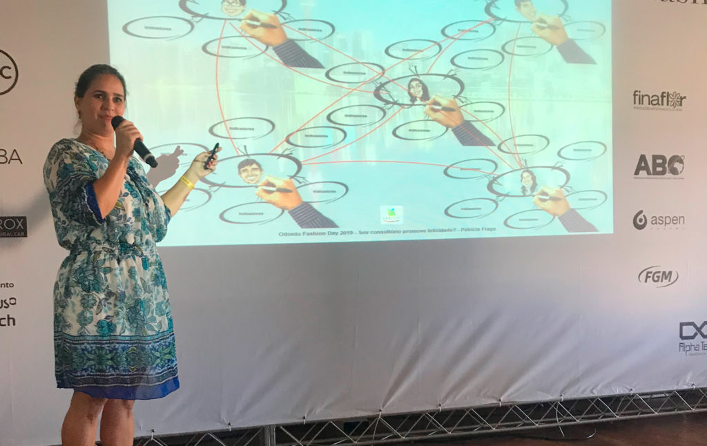
Figure 1. Conceptual diagram showing the relationship between architecture, color, and creativity.
Beyond aesthetics, environmental psychology and neuroarchitecture research affirm that color affects stress levels, concentration, and overall well-being, meaning that its thoughtful integration can foster healthier, more productive, and more inspiring environments. In creative spaces like design studios, innovation hubs, or classrooms, the careful balance of stimulating contrasts and calming palettes not only sparks imagination but also supports sustained engagement, while biophilic and culturally resonant palettes enhance identity, authenticity, and connection to context. Thus, color in architecture transcends decoration to become a catalyst for creativity and inspiration, a medium through which built environments actively nurture human potential and enrich the overall spatial experience.
Color as a Spatial Language
Colors function as a non-verbal design language in architecture. The selection of warm tones (reds, oranges, yellows) can stimulate energy and engagement, while cool tones (blues, greens, purples) promote focus, calmness, and reflection. Neutrals (white, gray, beige) provide balance and serve as canvases for highlighting focal elements.
- Warm colors: stimulate creativity and collaboration in studios or brainstorming areas.
- Cool colors: enhance concentration in libraries, classrooms, and private work zones.
- Neutral colors: provide balance, allowing other design elements, materials, light, and textures to stand out.
Figure 2. Example palette linking warm, cool, and neutral colors to different spatial functions.
Architectural Design and Creativity
Architectural design is a multidimensional process that goes beyond merely arranging spaces; it orchestrates elements such as light, materiality, geometry, and color to cultivate environments that inspire creativity and support human experiences. Light, both natural and artificial, interacts with surfaces and textures to define mood, highlight forms, and influence perception, while color works in tandem to evoke emotions, guide movement, and create spatial hierarchies. Material choices whether tactile, reflective, or transparent, add layers of sensory engagement, connecting occupants with their surroundings. Geometry shapes spatial relationships and circulation, enabling functional clarity while also generating visual interest. Importantly, cultural and contextual factors inform design decisions, ensuring that spaces resonate with local identity and meaning. By thoughtfully integrating these elements, architects craft environments that are not only functional but also stimulating, encouraging imaginative thinking, emotional well-being, and a deeper connection between people and the spaces they inhabit.
Case of Creative Spaces
Studies of coworking hubs, design studios, and educational spaces highlight how vibrant and varied color palettes foster a sense of playfulness and innovation. For instance:
- A studio painted in earthy tones with biophilic greens encourages a sense of connection with nature and open-minded thinking.
- Classrooms using contrasting color zoning can define activity areas (discussion, making, reflection), thus structuring creativity through design.
Figure 3. Illustrative diagram of a creative workspace, with zones defined by different colors to support varied activities.
Conclusion
The synergy between architectural design and color selection highlights a human-centered approach where spaces are shaped not only to meet functional needs but also to inspire creativity, well-being, and innovation. By carefully considering color psychology, cultural symbolism, and spatial functions, architects can design environments that influence perception, guide activities, and foster emotional connections, ultimately transforming neutral settings into vibrant, meaningful, and productive places. Color in this sense transcends the role of mere decoration; it becomes an active design tool that stimulates imagination, strengthens identity, and supports human potential, ensuring that architectural spaces serve as catalysts for inspiration and creativity while maintaining harmony with their cultural and environmental context.
Dr. Lamiaa Adel Shaheen is an accomplished Architect, Academic, and Researcher. Her expertise in the field has been recognized internationally, as evidenced by her prestigious UAE Golden Visa in the “Qualified professionals and Exceptional Talents” Category also recognized as Columnist 2024 Abayomi Academy, and Ambassador of Quality of Life UAE 2024, got 2nd place in the Abayomi Academy international Award for Physical space category 2024. With a Ph.D. in Architecture, she has dedicated her career to pushing the boundaries of Design and Innovation. Currently, Dr. Lamiaa serves as an Assistant Professor at Amity University Dubai, specializing in the Architecture and Interior Design Department. With a Focus on Sustainable Design and Human-Centric Spaces, Dr. Lamiaa continues to make a significant impact in the world of Architecture and Interior Design.
Get to know more about her: LinkedIn